Parallel Coordinate Plots
The Parallel Coordinate Plots page is the primary interface for analysing Parameter Sweep results. It provides two complementary views — a parallel coordinates visualisation for exploring multi-dimensional relationships, and a parameter impact analysis for quantifying each swept parameter's effect on performance.
Overview
When you run a Parameter Sweep, the result is a set of simulations that differ only in the parameters you swept. The challenge is understanding how dozens or hundreds of configurations relate to each other across many dimensions simultaneously.
Parallel coordinate plots solve this by drawing each simulation as a single line that passes through vertical axes — one axis per parameter or metric. Patterns in the lines (convergence, divergence, crossing) reveal correlations, trade-offs, and optimal regions at a glance.
How Racing Teams Use It
- Identifying optimal setups — Brush-filter to the lowest lap times and observe which parameter values the best configurations share
- Spotting trade-offs — See where improving one metric (e.g., top speed) causes another to worsen (e.g., minimum corner speed)
- Understanding sensitivity — Parameters where lines spread widely have high sensitivity; parameters where lines stay bunched have little effect
- Comparing aero packages — Colour-code by aero setup and see how each package clusters across all metrics
- Narrowing the search — Use brush filters to progressively narrow the field, then apply the shortlist to the simulation desk for detailed trace analysis
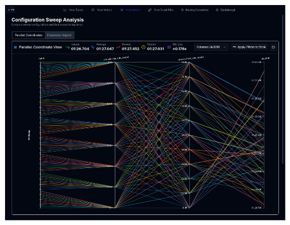
The Parallel Coordinates Tab
Reading the Plot
Each vertical axis represents one input parameter or output metric from the sweep. Every simulation permutation is drawn as a line that connects its value on each axis. The axes are arranged left to right, and you can customise which axes appear and in what order.
- Input axes (left side) show the swept parameter values — for example, front spring rate, rear ride height, or aero setup name
- Outcome axes (right side) show simulation results — for example, lap time, top speed, or energy consumption
- Line colour represents the sweep group or configuration, making it easy to distinguish different sweep families
Brush Filtering
The most powerful feature of the parallel coordinates plot is brush filtering. Click and drag vertically on any axis to create a filter range. Only lines that pass through the selected range on that axis remain highlighted — all others are dimmed.
You can apply brushes to multiple axes simultaneously to progressively narrow the selection. For example:
- Brush the lap time axis to select only the fastest 10% of configurations
- Brush a spring rate axis to see which rates produced those fast laps
- Add a third brush on a ride height axis to isolate the best combination
To clear a brush on a single axis, click on the axis outside any existing brush. To clear all brushes at once, use the clear filters button above the plot.
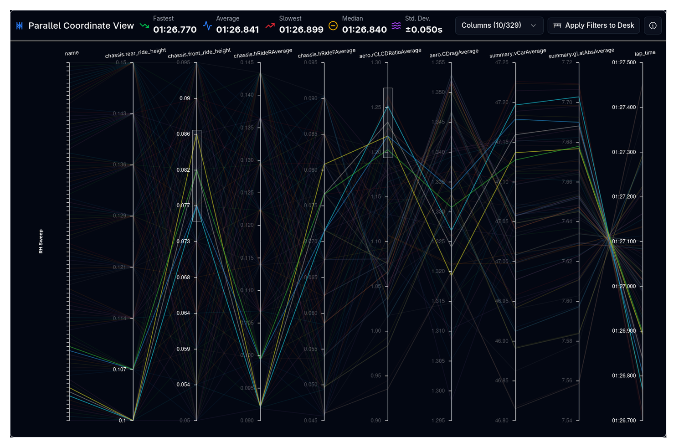
Reordering Axes
Drag any axis label horizontally to reorder the axes. Placing related axes next to each other makes correlations easier to spot — for example, placing front spring rate next to rear spring rate reveals how the combination affects the metrics on adjacent axes.
Hover and Selection
- Hover over any line to highlight it and see a tooltip with all its parameter values and metrics
- Click a line to select it persistently for comparison
Column Selector
Use the Column Selector button to control which axes appear on the plot. Columns are organised into two groups:
| Group | Contents |
|---|---|
| Input | Simulation name, swept parameter values, and lap time |
| Outcome | All output metrics (sector times, speeds, g-forces, energy, etc.) |
You can search for specific columns, and toggle the Sort Selected First option to keep visible columns at the top of the list.
Start with Fewer Axes
Begin with just the swept inputs and 2–3 key outcomes (e.g., lap time and top speed). Add more axes as you form hypotheses about which metrics matter most. Too many axes at once can make the plot hard to read.
Apply to Desk
After using brush filters to identify interesting configurations, click Apply to Desk to filter the simulation desk to show only the selected permutations. This lets you quickly move from sweep exploration to detailed trace analysis of your shortlisted setups.
The Parameter Impact Tab
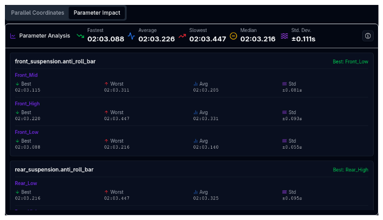
The Parameter Impact tab provides a quantitative breakdown of how each swept parameter affects performance. While the parallel coordinates plot shows visual patterns, this tab gives you the numbers.
How It Works
For each swept parameter, the tab groups all simulation results by their parameter value and computes statistics for the chosen metric (typically lap time):
| Statistic | Description |
|---|---|
| Best | The best (lowest lap time) result achieved with this parameter value |
| Worst | The worst (highest lap time) result achieved with this parameter value |
| Average | The mean result across all permutations using this value |
| Std Dev | Standard deviation — how much the results vary for this value |
Reading the Results
Parameters are grouped by their setup component (e.g., aerodynamics, suspension). For each parameter value, you can see whether that value consistently produces good results (low average, low standard deviation) or whether its effect depends heavily on other parameters (high standard deviation).
High Std Dev = Interaction Effects
If a parameter value has a low average lap time but high standard deviation, it means that value can be fast but its performance depends on other parameters. This is a strong signal to investigate which parameter combinations work best with that value.
Sweep Statistics

Above the plot, a statistics summary shows aggregate metrics across all (or filtered) permutations:
- Min — Best result in the set
- Max — Worst result in the set
- Mean — Average across all permutations
- Median — Middle value (less sensitive to outliers than mean)
- Std Dev — Spread of results
These statistics update dynamically as you apply brush filters, giving you an immediate sense of the performance range within your selected subset.
Configuration Details Table
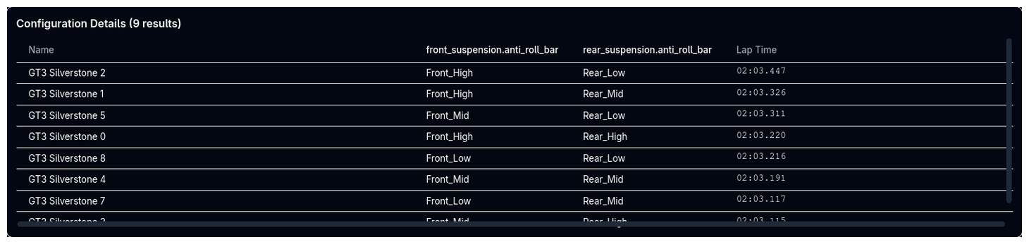
Below the plot, a Configuration Details table lists every permutation with its full set of parameter values and results. This table:
- Sorts by any column (click column headers)
- Filters automatically when you apply brush filters on the parallel coordinates plot
- Provides the exact values that the visual plot can only approximate
Use this table when you need precise numbers — for example, to record the exact spring rate and ride height combination that produced the best lap time.
Tips & Best Practices
Filter First, Then Analyse
Start by brushing the primary outcome (usually lap time) to select the top-performing subset. Then examine which input parameter values are shared across those top performers. This is faster than trying to trace individual lines across many axes.
Compare Sweep Groups
If your sweep includes grouped parameters (e.g., front and rear springs stepping together), the line colours distinguish each group. Look for colour clusters in the outcome axes to see which groups perform best.
Use Both Tabs Together
Use the Parallel Coordinates tab to form visual hypotheses, then switch to Parameter Impact to confirm them with numbers. If a parameter value looks good visually but has high standard deviation in the impact tab, investigate further before committing to that setup.
Export Your Shortlist
After filtering to your best configurations, use Apply to Desk to load them into the simulation desk. From there, you can run individual simulations with trace data for the most promising setups identified by the sweep.
Related Topics
- Parameter Sweep — Set up and run sweep simulations
- Metrics — View detailed metrics with scatter plots and tables
- Trace View — Analyse individual simulation results in detail