Trace View
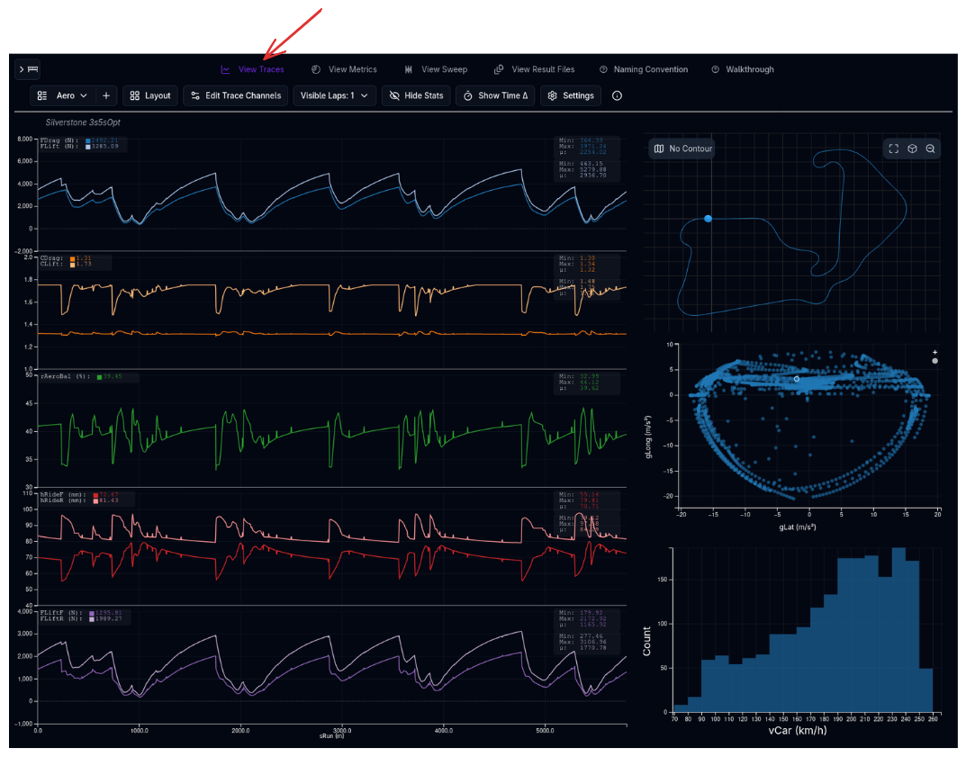
The Trace View is the primary interface for detailed analysis of simulation results. It displays per-point data channels — speed, g-force, ride heights, power, and more — as interactive line plots against a configurable X axis (Distance, Time, or Velocity), with a configurable grid of supporting visualisations including track maps, scatter plots, distribution plots, and correlation matrices.
Overview
While the Metrics page shows summary numbers, the Trace View shows the full picture — every data point across the entire lap or speed range. You can overlay multiple simulation results (or uploaded telemetry) to compare them visually, zoom into specific sections, and read off exact values with a synchronised cursor.
The Trace View is built around a configurable grid layout with five cell types:
| Cell Type | Description |
|---|---|
| Trace | Line plots of data channels vs. a configurable X axis — Distance, Time, or Velocity (the main analysis tool) |
| Track Map | 3D track visualisation with car position markers |
| Scatter | X-Y scatter or line plots of any two channels (e.g., g-g diagram) |
| Distribution | Histogram and density plots showing value distributions |
| Correlation | Heatmap matrix showing Pearson correlation between selected channels |
How Racing Teams Use It
- Lap analysis — Overlay simulation speed traces against telemetry to validate the vehicle model corner by corner
- Setup comparison — Load two configurations and compare ride heights, aero platform, or tyre loads across the lap
- Corner-by-corner review — Zoom into individual corners to examine braking points, minimum speeds, and throttle application
- Time delta analysis — Enable the time delta channel to see exactly where one configuration gains or loses time relative to another
- Powertrain analysis — Plot engine RPM, power output, and gear against distance to check shift points and power deployment
- Correlation discovery — Use the correlation matrix to identify which channels are most closely related, then plot them together
Getting Started
- Load one or more results into the Staging Area from the File Viewer (double-click a file, or select and click Stage Sim, or drag and drop files directly onto the staging area)
- A progress indicator shows loading status as results are processed
- Switch to the Traces tab in the results area
- The default layout shows a trace plot with speed (
vCar) against distance (the default X-axis setting)
Trace Plots
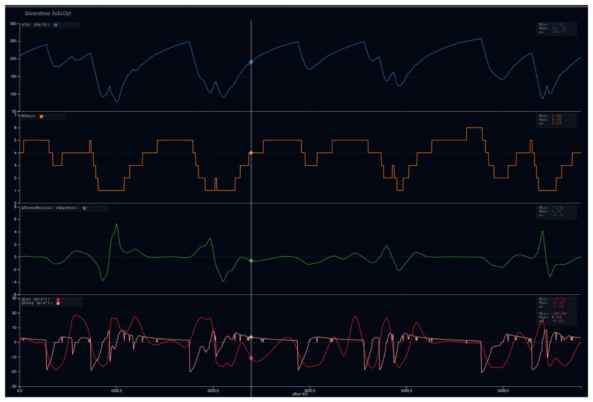
Trace plots are the core of the Trace View. Each trace plot displays one or more data channels as line plots, with a configurable X axis and channel values on the Y axis. The X axis defaults to Distance (sRun) but can be switched to Time (tRun) or Velocity (vCar) from the layout editor. When multiple results are loaded, each result is drawn in a different colour. Results that do not contain the selected X-axis channel are automatically filtered out with a warning.
Channels and Rows
A trace plot is organised into rows. Each row has its own Y axis and can display one or more channels. Channels within the same row share the Y axis scale, while different rows are stacked vertically with independent scales.
For example, a typical setup might have:
- Row 1: Speed (
vCar) - Row 2: Longitudinal g-force (
gLong) and lateral g-force (gLat) - Row 3: Front and rear ride heights (
hRideF,hRideR)
Dual Axis
When a row contains channels with different units or scales (e.g., speed and RPM), the trace plot can use dual axes — one Y axis on the left and one on the right. Axis colours match the channel colours when a single result is loaded, making it clear which axis belongs to which channel.
Editing Trace Channels
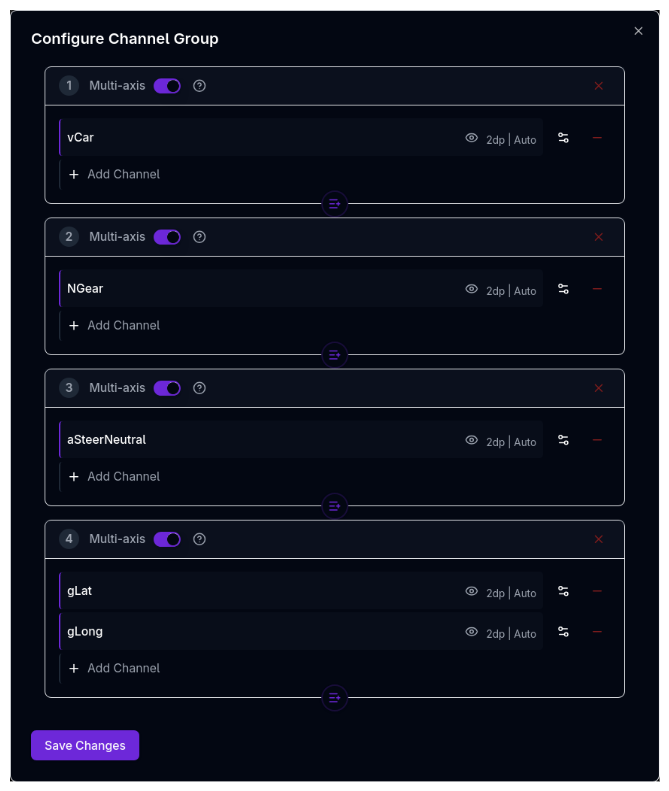
Click Edit Trace Channels in the toolbar to open the channel layout editor. From here you can:
- Add or remove rows to control the vertical stacking
- Add or remove channels within each row
- Toggle channel visibility without removing them
- Adjust row height weights (e.g., make the speed row taller than the g-force row)
- Configure plot bounds — set manual min/max values for a channel's Y axis, or leave on auto-scale
- Set decimal precision for cursor readout values
Hiding Channels and Metrics
You can hide specific channels or metrics from view without removing them from your configuration:
- Hide from Trace Plot: Click the eye icon next to any channel in the row legend to hide it from the plot. Hidden channels are grayed out and can be restored by clicking the icon again.
- Hide from Metrics: Use the visibility toggle in the Metrics panel to hide specific metrics from the summary view.
- Bulk Hide: In the Edit Trace Channels dialog, use the visibility toggle next to each channel to quickly show or hide multiple channels.
Hidden channels and metrics are not deleted — they are simply hidden from view and can be restored at any time.
X-Axis Channel
The X-axis channel for each trace cell can be set in two ways: click the X-axis label directly on the chart to switch inline, or open the cell settings icon (top-right of the trace cell) to configure it alongside channels and time delta. The setting is saved per cell with the layout.
Cursor and Statistics
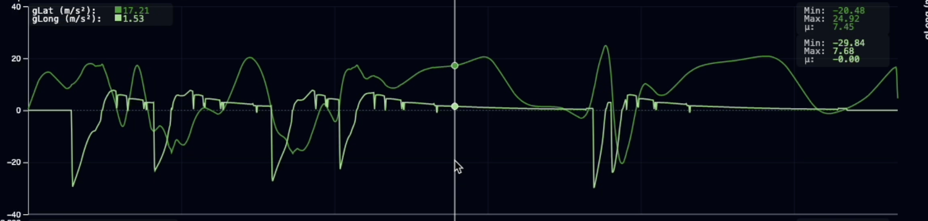
Move your mouse across the trace plot to activate the cursor. A vertical line follows the cursor position and the current values for each channel and result are displayed in a statistics overlay.
The statistics overlay shows:
- Channel name and unit
- Current value at the cursor position for each loaded result
- Min, max, and mean values across the full distance range (toggle with the Show/Hide Stats button)
Zoom and Pan
| Action | Behaviour |
|---|---|
| Shift + Click and Drag | Zoom into a rectangular region |
| Click and Drag | Pan the view when zoomed in |
| Double-click | Reset zoom to show the full distance range |
Zoom Persistence
Zoom state is preserved when you add or remove channels, change result references, adjust line width, modify grid opacity, or change distance offsets. Zoom resets automatically when switching to a different layout, since layouts can have different X-axis channels or scale ranges.
Track Map
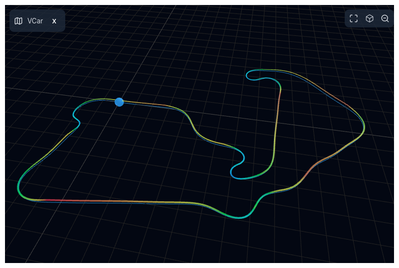
The track map cell displays a 3D visualisation of the circuit layout with car position markers. As you move the cursor across the trace plot, the car markers update to show where on track each result is at that distance point.
Camera Controls
The track map includes a camera control panel for changing the viewing angle:
- Top — Plan view (bird's eye)
- Front / Left / Right — Side views
- Isometric — 3D perspective view
- Fit to Scene — Reset the camera to show the full track
Map Contour
The track line can be colour-coded by a map channel (e.g., speed, g-force, ride height) to visualise how a parameter varies around the circuit. Select the map channel from the contour panel on the track map cell.
Scatter Plots
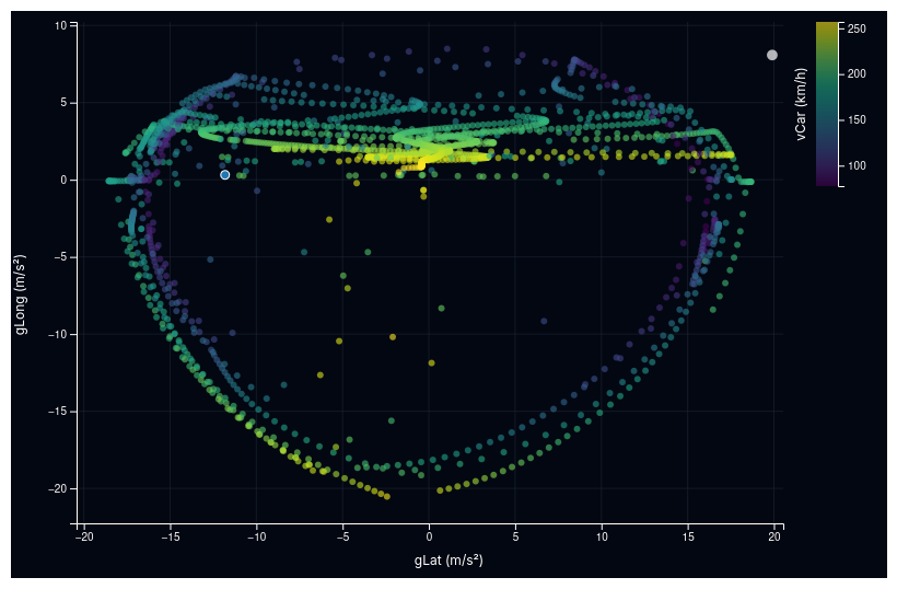
Scatter plot cells display two channels plotted against each other as an X-Y scatter or connected line plot. The most common use is the g-g diagram (lateral acceleration vs. longitudinal acceleration), which shows the tyre usage envelope.
Configuring Axes
Click on the X axis or Y axis label to open the channel selector and change the plotted channel. An optional colour channel can map a third variable to point colour.
Heatmap Background
Scatter cells can display a 2D heatmap background derived from your vehicle's aero or setup maps, overlaid behind the scatter points. Click the map icon in the top-left corner of any scatter cell to open the background map selector. A colour legend appears on the right side of the cell when a map is active. To remove the heatmap, click the X button next to the map icon.
Plot Type
Toggle between scatter (individual points) and line (connected path) modes. Scatter mode is better for showing the overall envelope; line mode shows the sequence of points around the lap.
Cursor Synchronisation
The scatter plot cursor is synchronised with the trace plots. As you move the cursor across the trace, the corresponding point is highlighted on the scatter plot, and vice versa.
Distribution Plots
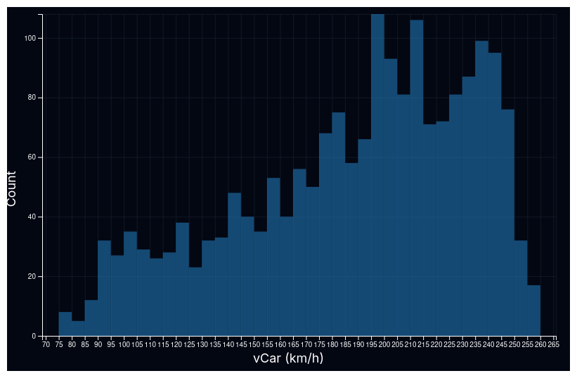
Distribution plot cells show a histogram of values for a single channel across the full lap. An optional kernel density estimation (KDE) overlay smooths the histogram into a continuous curve.
This is useful for understanding:
- Speed distribution — How much time is spent at different speeds (helps characterise the circuit)
- G-force usage — Whether the car is consistently near the grip limit or has untapped potential
- Damper velocity distribution — Check how much time is spent in low-speed vs. high-speed damper regions
Configuration
- Channel — Select which data channel to plot
- Plot Type — Histogram bars, density curve, or both
- Bin Count — Number of histogram bins (more bins = finer resolution)
Each loaded result is shown as a separate coloured distribution, with a togglable legend to show or hide individual results.
Correlation Matrix
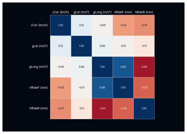
The correlation matrix cell displays a heatmap of Pearson correlation coefficients between selected data channels. Each cell in the matrix is coloured on a red-blue scale:
- Blue (+1) — Strong positive correlation (channels increase together)
- White (0) — No linear correlation
- Red (−1) — Strong negative correlation (one increases as the other decreases)
Configuration
Click anywhere on the correlation matrix to open the channel selector. Toggle channels on and off to control which variables are included in the matrix. When multiple results are loaded, the matrix analyses a single result — use the result selector to switch between them.
Interpretation
Typical correlations to look for in vehicle dynamics:
- Speed vs. longitudinal g — Negative in braking zones, positive under acceleration
- Ride height vs. speed — Strong negative correlation indicates aero platform sensitivity
- Lateral g vs. steering angle — Reveals the relationship between driver input and grip
Toolbar

The toolbar along the top of the Trace View provides access to all configuration options:
| Button | Function |
|---|---|
| Layout Selector | Switch between saved layouts (see Layout Management) |
| Layout | Open the grid layout editor to configure rows, columns (2D grids are now supported), cell types, and per-cell X-axis settings |
| Edit Trace Channels | Configure which channels appear in trace plots globally; individual trace cells also have a settings icon (top-right) for per-cell channel, X-axis, and time delta configuration |
| Laps | Select which laps to display (for multi-lap simulation results). A lap navigation bar also appears below the trace plots for quick zoom to any lap. |
| Show/Hide Stats | Toggle the statistics overlay on trace plots |
| Show/Hide Time Delta | Add a time delta channel globally. Individual cells also have a per-cell time delta toggle via the cell settings icon. |
| Settings | Open the settings dialog for colours, line widths, grid opacity, and other visual properties |
| Help | Hover to see a description of all toolbar controls and keyboard shortcuts |
Layout Management
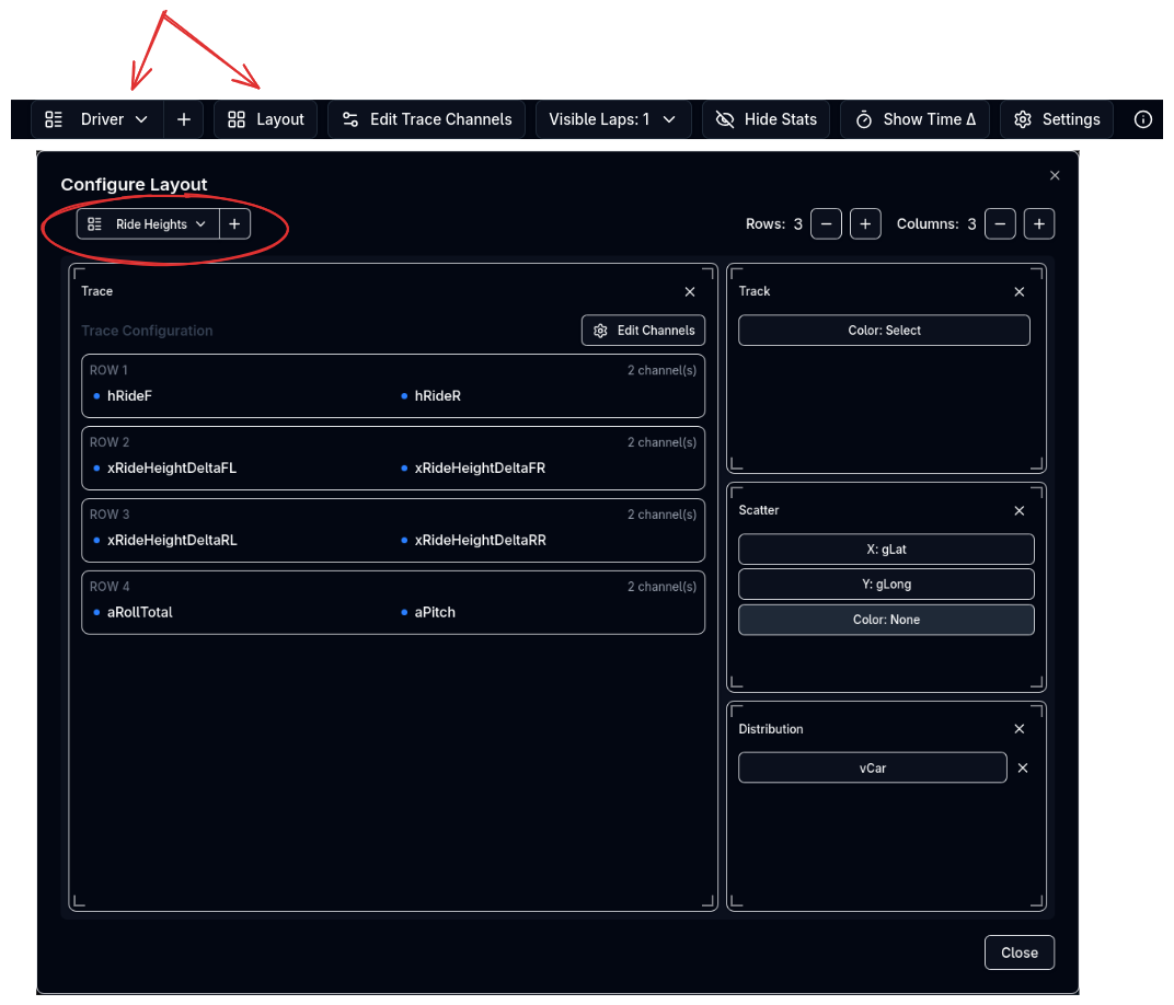
The Trace View uses the same layout management system as the Metrics page. You can:
- Save the current layout (grid arrangement, cell types, channel configuration) for reuse
- Switch between saved layouts using the layout selector dropdown
- Create new layouts, rename existing ones, or delete layouts you no longer need
- Search for layouts by name
Layouts persist across sessions. Common workflows include saving layouts for:
- Speed and ride height — A two-row trace with speed on top and ride heights below, plus a track map
- Powertrain — Engine RPM, power, torque, and gear in stacked rows
- G-g analysis — A trace plot alongside a scatter plot configured as a g-g diagram
- Full overview — A large trace plot with multiple rows, a track map, and a scatter plot
Time Delta
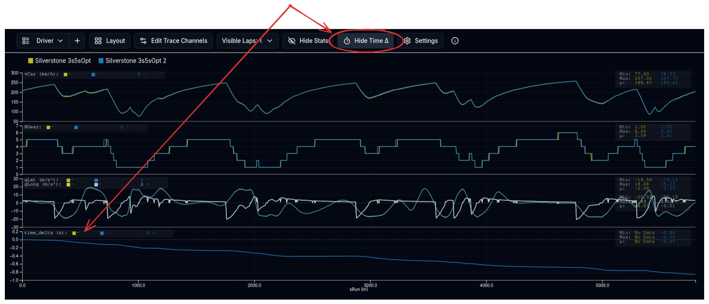
When comparing two or more results, enable Time Delta in the toolbar to add a channel showing the cumulative time difference between the first result and all other results. This reveals exactly where on the lap one configuration gains or loses time:
- Positive values — The comparison result is slower than the reference
- Negative values — The comparison result is faster than the reference
- Flat sections — No time being gained or lost (similar performance)
- Steep slopes — Large time differences (e.g., significant speed advantage on a straight or through a corner)
Reference Result
The first result loaded onto the desk is used as the reference for time delta. To change the reference, reorder the results on the desk.
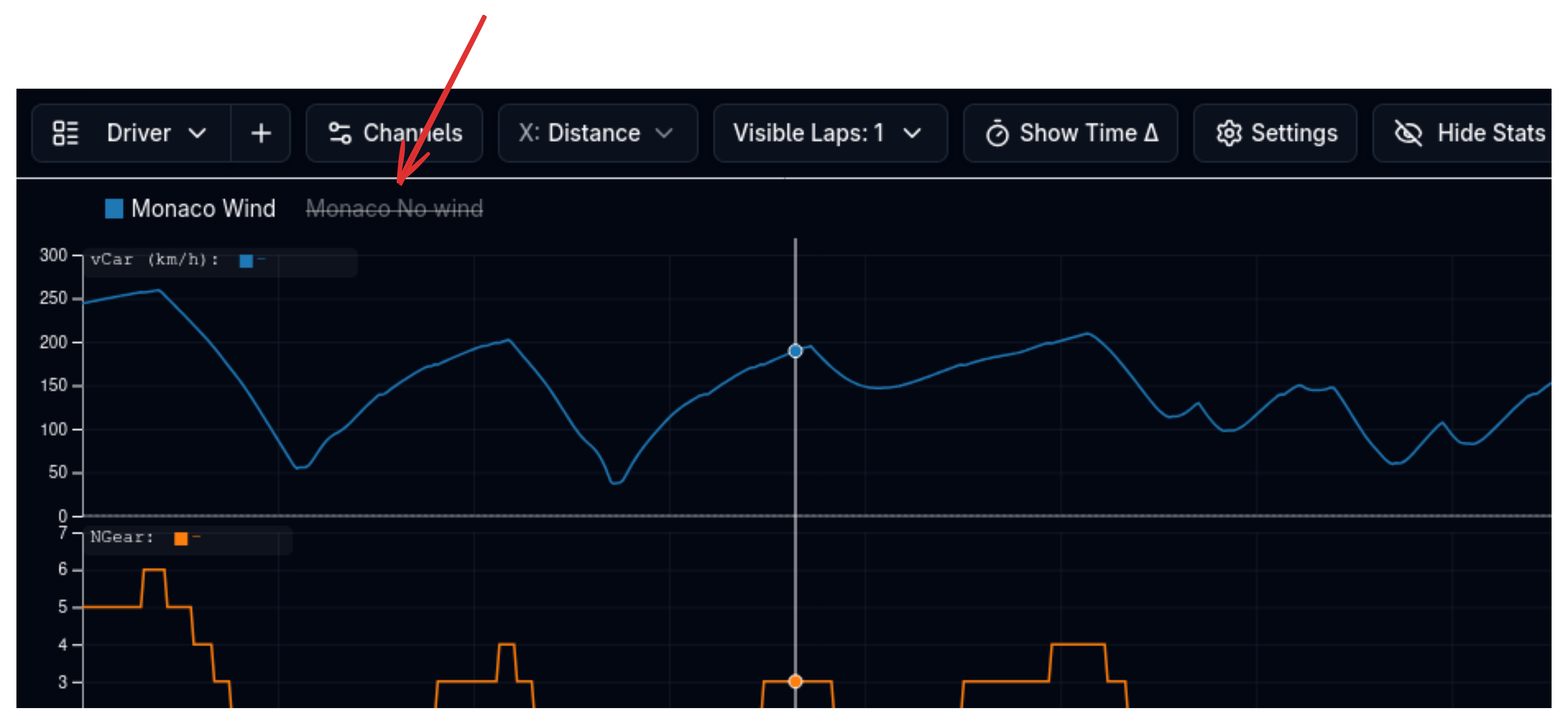
Legend
When multiple results are loaded, a colour legend appears below the toolbar showing the name and colour of each result. Click the colour swatch to change a result's display colour. Click the name to toggle the result on and off.
When only a single result is loaded, the legend shows the result name without colour swatches.
Toggling Channel Visibility
In the trace plot legend (within each row), click any channel name to toggle its visibility on or off. Hidden channels remain in the configuration but are not displayed in the plot. This is useful for:
- Temporarily hiding channels without removing them from the layout
- Quickly comparing different channel combinations
- Focusing on specific data without reconfiguring rows
Click the hidden channel again to restore visibility.
Settings
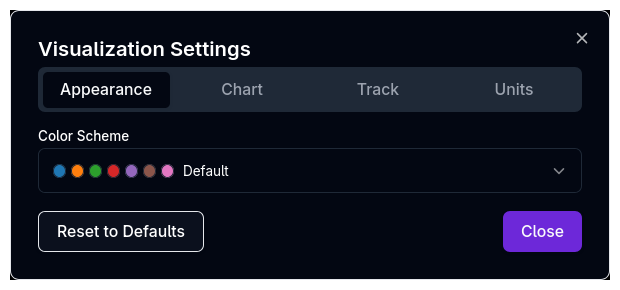
The Settings dialog (gear icon in the toolbar) lets you customise the visual appearance of all plots:
- Colours — Change the colour palette used for results and channels
- Line Width — Adjust the thickness of trace lines
- Grid Opacity — Control the visibility of background grid lines
- Track Width — Adjust the line thickness on the track map
- Car Radius / Halo — Control the size and glow of car position markers on the track map
Track Settings
The Track tab in the Settings dialog provides additional controls for the track map heatmap:
- Heatmap Colors — Choose between Continuous (smooth gradient) and Partitioned mode (discrete colour bands). In partitioned mode, set the number of partitions (2–20) to control how finely the channel range is split
- Camera Projection — Switch between Perspective and Orthographic projection. Orthographic removes depth distortion, making circuits easier to read as a flat map
- Nesting Offset — When comparing multiple results with a map channel, heatmap ribbons are offset laterally so they sit side by side. Adjust the slider (0–30) to control spacing
- Color Vision Filter — Apply a colour-vision deficiency simulation to all track heatmap colours. Options: None (default), Protanopia, Deuteranopia, Tritanopia
Settings apply to all cells in the current layout and persist across sessions.
Tips & Best Practices
Start with Speed
Speed (vCar) is the most informative single channel. Start with a speed trace to understand the overall lap structure, then add channels to investigate specific sections.
Use Rows for Related Channels
Group related channels in the same row to share a Y axis — for example, front and rear ride heights together. Put unrelated channels in separate rows so they have independent scales.
Zoom for Detail
The full-lap view gives you the big picture, but most engineering insights come from zooming into specific corners or sections. Use Shift+drag to zoom into a braking zone or corner exit.
Save Purpose-Built Layouts
Create and save layouts for different analysis tasks. A "Quick Overview" layout with speed and g-force is different from a "Suspension Deep Dive" layout with damper velocities, spring travel, and ride heights.
Time Delta for Comparison
When comparing configurations, always enable Time Delta. It immediately shows where the lap time difference is coming from — a 0.3s improvement might come entirely from one corner complex, or be spread across the whole lap.
Overlay Telemetry
Upload telemetry from the Results Upload page and load it alongside simulation results. The trace view overlays them directly, making it easy to correlate simulation predictions with real-world data.
Related Topics
- File Viewer — Load results into the Staging Area
- Metrics — View summary metrics across results
- Parallel Coordinate Plots — Explore sweep results
- Results Upload — Import telemetry for overlay comparison